Since I know next to nothing about wine, I often choose it based on the packaging. This is not surprising since I would be considered a visual person. Likewise, I hit Apple Trailers from time to time, and do select my trailers choices sometimes on the movie poster. The movie poster, much like the novel cover, has to essentially cram the tone and gist of the movie onto one frame. Font selections often suggest the theme of the movie (scary, modern, classic…) whilst an illustration very often denotes an indie feel as can the deliberate crafting of the movie poster.
========================
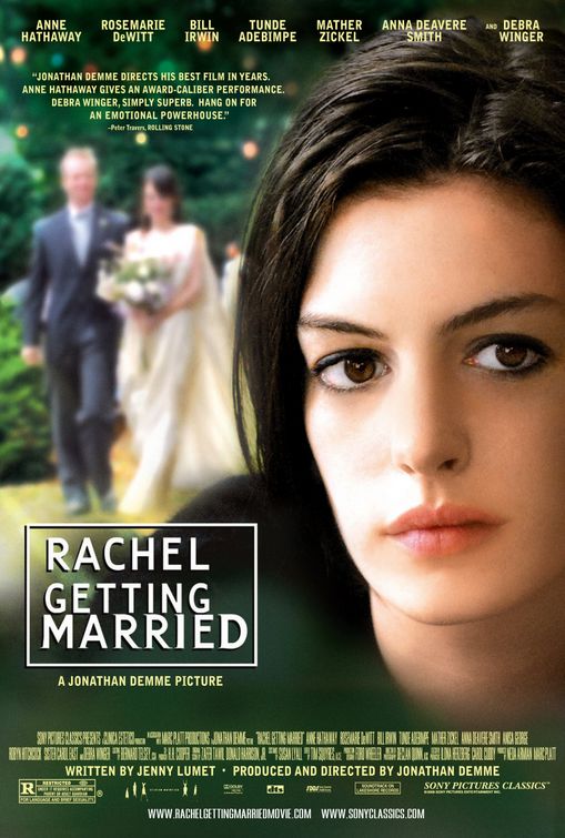
One of recent favourite movies would be Rachel Getting Married. Trying to boost ticket sales using Anne Hathaway’s star power while still keeping true to the hand-held, independent feel was attempted in the poster. My favourite part would be typography of “Rachel Getting Married” itself, with the word “Rachel” very obviously floating loosely about creating a wonderfully subtle feeling of discord and tension. However, I don’t feel the magic or the individual spirit of the movie was addressed in this poster.
Here are some others currently on Apple Trailers that caught my eye. By the way, I have seen none of these trailers or read the write-ups yet – wanted to see if I read the visual cues correctly.
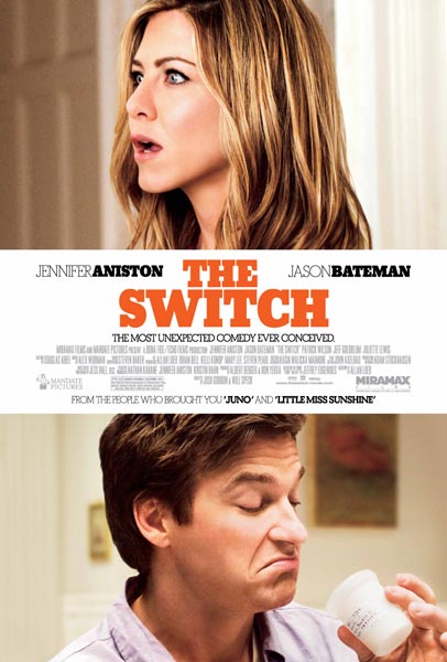
The Switch: I love the positioning of the content – split in the middle of the imagery – insinuating a switch point. Aniston and Bateman’s faces facing in opposing directions is also wonderful at visually playing up on the word “switch” because it forces you to switch your line of sight from Aniston to Bateman’s. Brilliant.
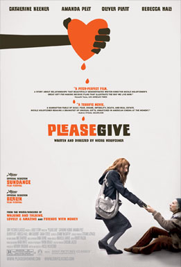
Please Give: Instantly one would consider this a somewhat independent film, with the wonderful introduction of sharp, Saul Bass-like illustration. My favourite part, however, would be the centralisation of content right till the picture hits and then splits the poster into immediate, strong, left and right alignment.
The Kids Are Alright: Ok, so I’m slightly biased towards blocked typography but the simplicity of this poster really works in drawing you in from the top, right down to the bottom. It’s quite impossible to look at the picture first, without having your eye magnetise right back to the block of typography. It almost keeps trying to nervously reassure you that “the kids are all right”.
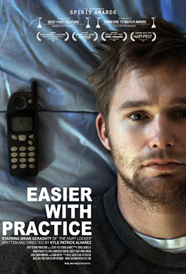
Easier With Practice: Clearly, alignment is driving this post – I love the use of mixed alignment in this one. You have centralised up top with the credits, the split left/right with the image and then you’re hit with a strongly right aligned block. The whole poster reeks of tension and from the get-go, you know this movie is going to be about internal strife.
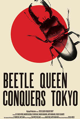
Beetle Queen Conquers Tokyo: I have no clue what this movie is about – but my love for Swiss/German design let this poster catch my eye. It is a most literal interpretation of a title – you have a beetle and you have a red circle. What I find interesting is that the title says “conquers” and yet, the red circle is multiplied over the beetle. I would really expect this movie to feel completely old school, like a world war documentary. I’ll watch the trailer to see if I’m right.
I Am Love: I love the way the typography flows over and within the cast photo, deviously – with intention. The unfurling typography covers everyone’s faces except Swinton, which immediately places her at the centre of the story and most likely, the puppet master.
========================
The movie poster is so key for people standing in front of about 10, trying to choose the movie that fits their mood and company. Blockbusters are often the most forgettable and bluntly direct – and very often, don’t become the cult success posters that you’d find on college room walls – like Scarface. Try playing the movie poster game on your own.


i just found this post somehow,and I absolutely love your artistic eye. I’m reading through random posts and am fascinated by your obvious talent at picking out subtleties in art.
Maybe it’s because I’m completely inartistic that I’m so easily impressed.
Not to be too personal, but it’s obvious you do this for a career. Where are you from? How old? How did you get into this? I’m curious as all can be…
Hi Jason!
Yes, I definitely do this for a career. I’ve been designing for years now, and an Art Director for most of them. I’m from the tiny red dot on the map – Singapore, which I believe is 45 years old, since it’s independence. 🙂
I think I’ve always been a creative person (although I don’t necessarily make the best art and I can’t draw to save my life) so, it was either drumming or this. Thanks for reading!