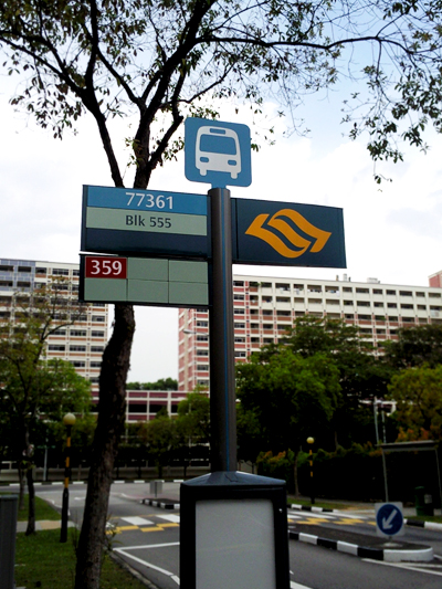
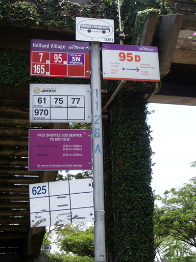
The powers that govern sunny (oh, God, is it sunny) Singapore have decided to grant fresh water for the horses and revamped bus signs for everyone!

Although I have no clue what that wavy yellow sign is supposed to mean (someone didn’t consider user interaction when they designed that sign…), it looks a shitload better than the old ones. At least the bus icon is sleeker and doesn’t look like a tram from the days of Raffles. Using less metal gives it a much more modern and approachable look – and less likely to get tetanus from. All in all, a step in the right direction.

