This would probably be the most on-going battle of every designer – the quest for the perfect font for that piece of work. Fonts can make or break a design (ok, so can a lot of things) but to me, it’s often one of the first parameters I set for myself. It’s the one luxury of time I afford myself – I can spend forever going through my font library to pick that right font. And that’s just work for myself.
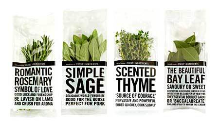
Picking fonts for client work is a whole other ball of wax. Picking fonts for clients who have absolutely no clue about design is probably one of the levels in Dante’s Hells. It’s very easy to spot these people – they almost always use Comic Sans. *Shudder*. Even typing that out gave me the heebie-jeebies. Not just that – they don’t think there’s anything wrong with using Comic Sans. There’s no excuse to not know better – the world is so much more beautiful beyond your Microsoft Word window. The next time you’re walking around the supermarket, stop in front of the Waitrose stuff and look and how pretty fonts can make things. Waitrose typography makes me buy their stuff. Period.
I’d like to say that I’m not font-discrimanatory and that I love all my fonts equally, but that would be a lie. My taste for fonts changes like the seasons and all my work at that period of time would usually reflect that current font favourite. When I first started out, my favourite font was (of course) Helvetica. I then followed it up with a passionate distaste for it and very seldom use it now. I will not, however, contend that it’s not a beautiful font. Used properly, it’s still absolutely gorgeous.
I’ve recently had a struggle trying to convince a client to keep a serif font in the layout of a magazine. Ok, it wasn’t really a struggle because I gave in at the first request. At point do you argue the use of a serif font versus a sans serif font to someone whom you think might not understand it? There’s more to life than font selection, do I really want to clog up emails and client relationships? Why do serif fonts get such bad reputations by mainstream civilians as being old-fashioned and difficult to read? Most international magazines from Time to Vogue use serif fonts – and these are considered the cutting-edge publications of their fields. It makes the content always seem more distinguished, reputable and concrete.
Something about a magazine being typeset completely in sans serif fonts makes it feel more like a newsletter and amateurish. Of course, I’m sure there are many lovely designs out there that can disprove this. Regarding the magazine, we have reached a somewhat medium of the headlines and standfirsts being set in serif fonts.
When I dropped Helvetica as my favourite body copy font, I entered a brief sub-serif phase of Optima. I then found my new (and current) favourite body copy font in Avenir. It’s got reasonable amounts of weight, a nice, mildly low-anchored x-height and reads well when it’s reduced to a running 8point body copy. Just kidding – no client in this world will let body copy go at 8pt.
So, you can be certain that if you’ve got body copy and a lack of identity, you would most likely get the “summer me”. Next season, the “winter me”.

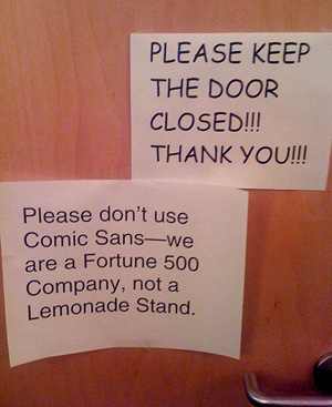

GREAT post! I deal with this all the time. And that photo about Comic Sans in a professional setting made me laugh out loud.
http://www.denwrites.com
Nice post!
This is so true. A font really can make a difference and make or break your design. Great post and really witty!
Comic Sans is aptly named. It is truly hilarious:)
“There’s more to life than font selection, do I really want to clog up emails and client relationships?” Haha, I think it’s funny the way you put that.
I almost always prefer sans serif fonts. They feel friendly, inviting and have a soft, approachable look 🙂
I like the old fashioned one the best. It’s time-tested and proven. You never know if the new ones are going to last, and you wouldn’t want your bathroom sign to look outdated in a few years.
The Codger
http://thecodger.wordpress.com/
Ugh, Comic Sans. The bane of my existence as a former design-oriented person, rivaled only by Papyrus as the most overkilled (and not that good anyway) typeface.
Since I’m no longer into art as a career, I can’t really afford to buy fonts, so no Avenir for me. So I still stick with Helvetica, it’s nicer than the default Calibri on the charts I make in Excel. Bleh. Just because I’m a scientist now doesn’t mean that the default stuff in these applications aren’t completely unappealing to me 😛
Great post! I often experiment with fonts, and do tests on them to see which look best and which ones I like best. Yes, Comic Sans is very … unprofessional. But it’s still fun to use for casual writing, like e-mails to friends and maybe your grocery list. 🙂
Web Designers deal with this quandary all the time! Too bad most clients “don’t get it!” While we fuss and fret over fonts and layouts, they want all sorts of blinking things, crowded pages, and my favorite — “can’t you just make it look like my brochure?”!! Gotta luv ’em, tho — they pay the bills!
This post made me smile. I am a science type person who generally wonders why some people toil over something as simple as a font. But, I have to admit, when a particularly hard-ass professor printed all of her exams in Comic Sans – the entire class took notice. Most of my professors refused to accept work in anything but Times New Roman.
I worked at a Fortune 500 company once. Comic Sans is exactly the font to use in such a setting. Now I work in book production, where serif is always the right choice for book blocks. Covers are another story. Great post!
I used to HATE Helvetica. I’m becoming more of a fan. I still HATE san serif for body copy and I DETEST both Comic Sans and Papyrus. THEY ARE EVERYWHERE! They haunt me.
Crystal
http://www.crystalspins.com
Great post! As a designer, I often find myself getting incredibly frustrated when I’m not working and am subjected to poor font choices (menus, company signage, etc.) I especially hate seeing scriptive fonts, and wedding invitations/programs that use scriptive fonts for everything and capitalize every second word! I used to prefer only sans serif fonts, but have come to appreciate a few serif fonts.
great post
My favorite font right now has got to be Lucida sans Unicode. I simply love it.
I do agree with you that serif fonts seem to possess more gravitas
Well put! This reminded me of something my daughter showed me a while back; we thought it was hysterical and nobody else could understand what we found so amusing:
http://www.youtube.com/watch?v=i3k5oY9AHHM
http://cegrundler.wordpress.com
Great post. I have a (web designer) friend who refuses point blank to buy from any company that uses Comic Sans. I couldn’t agree more about Waitrose, too, the sassy look of some of their products is proof of how powerful a font can be.
You might have dug a little more deeply into the issue with your client, rather than argue with them. Serifs give the eye clues as to the shape of letters, so it’s actually less stressful to read in large blocks of text. So it’s no coincidence that books (remember books?) and magazines use it.
Sans serifs have design appeal, certainly (with the exception of comic sans, of course). But it’s worth it to look up the research on these things.
So great! I often struggle to find the perfect font as well…cycling through hundreds of fonts with that one pivotal word that ends up not looking correctly spelled anymore after viewing it in about the 10th font. I’ve been quite a fan of Garamond when I’m looking for a serif, but when I need a san serif, I tend to pull out the Tahoma or Verdana…
Exams in Comic Sans? Yikes! Burn my eyes immediately!
Just watched the movie HELVITICA via NetFlix. As a non-design professional (but closet admirer), really dig this post.
http://www.cigarlaw.com
Serif it is. I am ex- typographer turned salesman. Sans was born out of better reproduction quality and the quest to improvise. I love serif fonts, they are timeless and eternal like the greek sculptures. Bodoni take a bow.
kvpops.wordpress.com
I read not too long along that “Helvetica is nice. But it won’t turn water into wine.” I’m not a designer but I do like fonts and poking around with them. Big fan of Century Gothic at the moment.
I… think I’m in love.
The reason people still use Comic Sans is because it was THE font in its time. When computers were new and exciting, the only fun font was Comic Sans. Now, there are far more interesting fonts, and Comic Sans is reserved for things mocking the 90’s.
As for serifs, I hate them. I’m not really sure why, but I have always had a distaste for them. In a magazine or newspaper as the body, I can deal with it. But when it is a website or a product label that isn’t supposed to look like it’s from the 1800s, it makes me want to pull the person who chose the font out of my computer and scream some sense into them. I dunno… I’m just biased I guess. I guess Times New Roman must have scarred me by doing something inexcusable. Bad Times New Roman.
<3 Milieu
thanks for that insightful entry!
i kind of feel stressed out about picking out fonts now, though. haha.
life used to be so simple when back when I thought comic sans was appropriate…
It’s good to see that there are others as obsessed with picking fonts as I am. I feel like I’m going crazy when I have to sit there sifting through thousands of them looking for the right one for a particular project.
Thanks for sharing. Cheers!
People can be poor and just whining about stupid fontnames and high society prices. I love Calibri font. I do love seriously.
Not working in design area, I have mostly had the luxury to stay out of font discussions. However, I am strongly partial to serifs—and I do have a favourite font: Computer Modern Unfortunately, this font has never been taken under the wings of e.g. Microsoft and has therefore not had a big impact outside of TeX and LaTeX (mostly used for scientific publications).
Comic sans type face left a letter on my doorstep one day defending itself…http://upwoods.wordpress.com/2010/07/11/comic-sans-type-face-speaks-up-i-have-a-write-to-exist/
🙂
comic sans annoys me too. teehee.
Smile 🙂
http://ninjawiththeorangetshirt.wordpress.com/
This is a great post and one that we should all explore as bloggers! Love your sense of humor and irony!
The most outdated font type for me would be comic sans. if i see it, i involuntarily nauseate hahaha
I have enjoyed this post. As an amateurish design person trying stuff out, it’s good to hear about font styles from someone who knows what they’re doing. Are there any books about fonts you would recommend?
Never seen a breakdown of fonts like this, but I rather enjoyed it! Congrats on freshly pressed!
Type is as important to design as a chair is to a hospital. Both come in different shapes, sizes and colour, different people like different styles and different styles suit different asses. Ultimately it’s the whole package that’ll make us choose a certain hospital. Not just the chairs. =)
Looool!! thats so true! !
font is everything!
LOVE.
SUMMER.
haha! The Comic Sans picture is great!!
http://sylviangirl.wordpress.com/
I too share your disgust for the C-word font. Interestingly, Avenir is my employer’s corporate font. I’m a little all set with it, but it is a very nice font. It’s Helvetica all grown up. 🙂
I don’t deal with fonts professionally, but I fuss over them every time I open a new document. I always want that special feel for whatever I’m typing, and loathe overused fonts just like Comic Sans. Others include Bradley Hand ITC and Papyrus now, too.
Personally, I prefer any font where the one can easily tell the difference between “I,” “l,” and “1” (eye ell and one).
I’m just saying…
IIIIIIIIII
llllllllll
1111111111
Great post. I love the Comic Sans pic!
I personally like serifs better (one of my favorite fonts is Book Antiqua). As for the Internet and websites, sans serif fonts are fine tho…
Personally, I prefer Serif fonts because I am just dyslexic enough that I find it easier to read Serif fonts as opposed to the Sans Serif fonts. Sans Serif is really useful sometimes though.
Thanks for this!!!! Had a great laugh. I’m linking back to this post. Peace & love
I had a boss who wrote everything in Comic Sans…so unprofessional for business writing! For my header WordPress, I chose Mistral, which reminds me of the broad strokes of a fountain pen and for the subtitle, I used Papyrus (my apologies to all the Papyrus haters) simply because it felt right for the look I wanted. Congratulations on being Freshly Pressed!
It is quite nice to see someone have an intelligent conversation about fonts, it reminds me of sitting next to my Mom while she sets up some software for some random company. You are not my Mother from an alternative reality are you?
comic sans was SO 8th grade
Love this! I go through this all the time.
The one I hate the most and used by some secretary that pretend to be graphic designer and are proud to create a beautiful logo or a business card is Zapf Chancery.
Serif font are quite often used for books and magazine for a better readability, it is a general rule in printing and design. I studied in typography 15 years ago.
I think my least favorite of all the fonts is Papyrus. Naturally when I was in 6th grade I thought it was awesome, but it is so overused! I’m a classics major, and when I was looking into graduate schools, almost every single classics department used Papyrus on their webpages. It was so frustrating!
I’m glad we can all agree about Comic Sans.
I’m even happier that seven people have also already mentioned Papyrus.
Really great post about font usage – it really can make or break a great design.
I loved this! I am actually going into graphic design and advertising as a career and this just made my day. as a yearbook major we delt with this stuff all the time for our copy and the way you wrote this was hilarious!
Helvectica has its purpose. mostly a mean font to be used anywhere nothing fits better.
I find myself being grown towards, Nevis, Calibri, And the droid family. Although i may get shot for this, I have to say, bleeding cowboys has a lot of uses too.
I also change font preferences from time to time. My first love is Comic Sans (that was way back in Grade school, and hate this font a lot now), then became Impact. Now, my favorite is Helvetica and/or Century Gothic.
my thoughts on font choice and body copy… Some serifs were designed for reading long passages in print, Times, Minion, Adobe Caslon, for example. So using a sans/tweener such as Avenir (Optima, etc) as print body copy can be a bit wearing on the ol eyeballs (not that Times is the serif I’d actually use, but perhaps I’ve made my point?). On the flip side, Verdana and Georgia were both created for screen use. Using serifs on screen is tough for eyeball longevity.
Blah blah blah anyway, a good rule for people on the font fence is to test out your font choice in print (if that’s your final medium) before comitting to it for the long haul. give it time to settle. you may be surprised what’s compelling and what’s annoying.
Great Post! I love the caption about not using a comic sons font by the way.
I was just having this discussion with a friend who was using serifs (Georgia) on his website.
My argument was that if google and facebook use Sans Serifs you can bet that they’ve tested it extensively for click through rates.
He felt that serifs would fit more for his readers as he is focused towards retirees.
For me the BBC website reads sooo much easier the the New York Times – bbc no serifs nyt serfis.
Road signs are always Sans Serif.
That said, I couldn’t read a book in Sans Serif.
My take is that serifs are good on paper and Sans serifs are good on screen.
I love LOVE that photograph.
Wonderful, fun post.
I use both styles of font equally as headers, but serif fonts as body copy are a must.
Have you tried Franklin Gothic? That is who I a have my sans serif love affair with.
Deciding on fonts can be a real struggle, but I agree they can really make a difference in whatever it is one has to communicate. I used to like Comic Sans back when I was in grade school!
Great to read about another designer weighing the many options of serif vs. sans serif. I’m also guilty of spending time trying to choose a fitting and appropriate font in a design. I agree that it’s important — and it can really make a design stand out (as in your Waitrose packaging example). Great pic of the Comic Sans sign!
I deem that it is a great post and we should all explore as bloggers! Love your style.
Frankly speaking, I do not interested in your article. I think the girl in your blog is beautiful.
Avenir is very attractive!
So glad I swung by freshly pressed this morning. I needed a good typographically inspired laugh.
Great post! Thanks for sharing your thoughts!
Actually, I kept using Arial and Times New Roman for years. When one of my university teachers explained the difference of serif and sans serif font types to me – and how to make texts look better by carefully choosing them -, I first started experimenting with fonts. At the moment, Tahoma is my favourite for online texts and Garamond for printed ones.
I love types like Lucida Blackletter – they just look beautiful -, but I don’t use them, because they are way too difficult to read.
Nice post! I have always simply stayed with the “easy to read” Times New Roman and Arial fonts recommended by college professors for proper formatting. Thanks to your post, I am now aware of the need to explore other types of fonts especially when writing blogs and trying to bring some freshness to the site. And, if anything else, I know not to chose Comic Sans 😉 Congrats on Freshly Pressed! LB
a leading worldwide w holesaler company (or ucan say organization).
w w w . Yahcc . u s
We supply more than 100 thousand high-quality merchandise and famous brand name products all at wholesale prices.
Does anyone on here have a recommended font as the best for training manuals? I’ve been using Verdana partly for personal preference and partly because it’s the font used in all manuals on our website (I work at a University), however after reading this and having it pointed out that a serif font will increase comprehension I’m willing to change.
Any recommendations?
T.
Over 100.000 Softwares Free Downloads at softepic
ha ha. unfortunately, i’m s sans serif too! except for the vintage typewriter thing, which i do love a lot.
Nothing can be worse than sitting through a 2 hour college lecture of power points where each slide is nothing but paragraphs in Times New Roman. Its horrendous!!
very nice post! and hilarious picture to boot 🙂
i’m a sucker for adobe caslon…but i’ll take helvetica/avenir/gotham too.
just anything other than archer. EVERYONE and their mom is using archer. annoying.
Good article. Fonts certainly serve a big factor may it be in writing or promoting something. Comic Sans looks good on entertainment or any humorous stuffs but definitely it’ll look absurd on a newsprint or just like what we see on that pic you posted. People who’d bump in and read this post will surely learn something. Thanks for posting.
Online Parenting Class
Great blog! I genuinely appreciate the way it? s straightforward on my eyes also as the Information are well written. I’m questioning how i might be notified when a new publish has been created. I have subscribed to your rss feed which will need to try and do the trick! Possess a nice day!