(Yes, the title of this post is set to that Tina Turner song)
As a designer, one of my most disliked pieces to create, is definitely the logo. Some designers and agencies do no more than indulge their passion for logo and identity design – for me, I am not a fan. And this is not because it’s something I’m incapable of doing, but I’m a fan of branding beyond the logo. If you’re looking to start a business, and want to create an identity, the logo should ultimately take up about 10% of your vision, and the other 90% going into their branding. Yet, a lot of people I interact with, place about 80% of their time and vision into their logo and the remaining 20% into their branding.
Here’s where I see the problem.
A lot of focus goes into the trying to make the logo define the business – the directive is usually, for the logo to represent the business activities, its business motto, its ambitions and value. For goodness sake, it’s a logo, not a holographic personality. To illustrate my point, here’s a couple of logos where the brand recall (see, it’s “brand recall”, not “logo recall”) is infinitely more powerful than just its logo.
![]()
Good ol’ Coke. Who the hell even cares about their logo? All I care about is that it ain’t blue (Pepsi). When I think about Coke, I don’t think about it’s font-patented logo. I think about its bubbly, gassy, deep brown, refreshing goodness. I think about it on a hot day. I think about my teeth rotting sometimes. When someone asks me if I want a Coke, its logo is the furthest thing from my mind. It’s branding and extension of personality have far exceeded the limitations of a “logo”.
![]()
Everyone’s favourite brand to bring up, when branding is discussed. Nike. A brand more powerful than it’s swoosh. Ok, in the late 80’s and 90’s, the “swoosh” was a huge thing – mostly because it was a great experiment in branding. Nike released products with only the swoosh, and left out the “Nike” word. Brilliant. The brand survived. Turns out – they made something so good, they didn’t need to get by on just their name. They built a brand based on endurance, perseverance, and sportsmanship. And what survived from all this? Their tagline. Do I even have to say it?
![]()
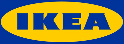
Look at the Ikea logo. Really look at it. You could put this logo on anything and it would still make sense, or no sense at all. And yet, when the word “Ikea” is mentioned, your brain conjures up: Modular, Swedish, meatballs, the scent of inexpensive pine, allen keys, seemingly simple assembly and the inexplicable reason why you never leave Ikea empty handed.

If asked what’s the first thing I think about when someone mentions “Singapore Airlines” – it’s definitely not the bird logo (you mean you didn’t realise it was a bird?). 9 times of out 10, it’s the Singapore Girl that’s envisioned, followed by service and quality. I honestly do not think anyone thinks of the logo.
———–
Moral of the story: The logo is not your business’ glory point. Look at it this way: Your logo is equivalent to your name. And yet, there’s more to you than your name. There’s your personality, how you handle bad times, how you laugh, the friends you keep, the tv shows you watch, the shoes you wear. All these parts exceed the sum of your name, and by extension, your logo. Think of your business as your child. You spend at most a couple of months deciding its name and, then the next 18 years shaping its person. Look at that in relation to your time spent on the brand. Stop worrying about the font – and worry about what the sentence is. Stop worrying about the colours – and worry about the vibrancy of its personality. Once you have all this set in place, find the designer that understands how translate your branding language, visually, and you’re on the right track.