Since my last political post was such a success, (thanks to all 3 of you who read it), I’ve decided to take this in a direction that I know about – branding. All my comments are based on my personal opinions (duh) and do not reflect the policies or action of any of the mentioned political parties. </end disclaimer>
So, it’s election time in Singapore and we all know what that means. Our normal, carefully-landscaped towns will be plastered with party logos and faces. Much like this:
Good lord. There’s only so much a designer’s heart can take before I rip off the poster screaming, “No more drop shadow!!” (Dear po-po, please don’t arrest me, I’m not going to remove these posters. It’s just cynical wit) I have no idea why every political party in Singapore have the same damn posters – one with all the faces of their representatives, and another of their logo. And that’s it. In every town, every political party uses the same damn formula. You’d think that with the directive to move into a first world parliament, we’d at least try to look smart about it.
Needless to say, the ruling People’s Action Party goes for the same look at every print run – blurry background of the city/people with a tagline on the front. Thankfully, this time they have dropped the ridiculous 80’s photoshopping of feathered multi-racial faces. Oh, I’m not kidding about the feathering. To their credit, this has been their look and feel for years and they’re running with it. I genuinely wish someone would advise them on how to use their logo properly on a coloured background, without that feathering.
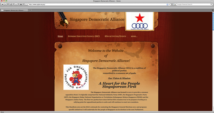
Then, there’s the contesting opposition party in my town, Singapore Democratic Alliance. This is their website.
Talk about a visual rock and a hard place. This website pains me. The complete lack of cohesion between the logo and the look and the feel is unsettling. I’m assuming this is obviously a template, which makes me feel bad for them but at the same time – a plain white blogpress with black fonts would have elevated their brand value 100 times over. This is not a simple case of “is this pretty?” or “would I pay $2 for this product?”. This question you ask yourself is “Do I want them in my government?” A political party is a product like any other – from your first point of contact with them, you need to know what they do, what they believe and if they’re good at it. After that, everything falls into place. The best branding is often the simplest because it gives the individual room to place themselves within your personality. This website makes me want to play World Warcraft or something. Horrendous.
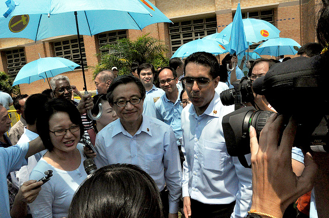
This is a photo of a Worker’s Party team after Nomination Day, 27th April 2011. This is the perfect example of when an brilliantly simple idea transcends the visual appeal. They gave out umbrellas. Whoever thought of that idea should pat themselves on the back. 1. They’re lighter than carrying flags. 2. Your logo (which is imperative for Singapore voting) is ever-present 3. It offers the intangible feeling of protection 4. It was fucking hot, so they made sense.
So far, the party leading the way in political branding has to be Singapore Democratic Party. I’m pretty sure they have a professional designer/advisor working with them. I know this because nobody else would think of doing a favicon for a website. Not only that, they have actually used Facebook tabs to help expand their fan page. They’re also made excellent videos, have teaser lead-ins to all their videos, are consistent with their clothes. Perhaps the one area that they’re missing is response to comments on Facebook. That would definitely elevate their value because people don’t just want personality, they want personal too.
[youtube=http://www.youtube.com/watch?v=OxqMltjX-Ek]
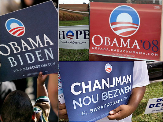
And now it’s time for the juggernaut. When Barack Obama was running for the 2008 election, his team came out with such a beautiful logo. It makes you feel so tender, hopeful and patriotic and I’m not even American! I loved that they employed such cohesive branding tactics – it made their campaign feel so elegant, so put-together and tight. Beyond the printed materials, he even had theme songs. Talk about a well-rounded campaign. Here’s a great article on the development of the 08 logo.
I think a lot of people would feel that the PAP has more money – thus equating more presence but that shouldn’t be the case. It’s the smallest budgets that inspires big ideas. I wish that in the last 5 years, these opposition parties would have incorporated solid design that moves by itself – that people want to use as a car decal, or a t-shirt or put in their storefont. The product is obviously the most important part but so’s the wrapping.


